How John Pasche created the Rolling Stones’ iconic tongue logo
July 18, 2026
John Pasche, a design student at the Royal College of Art, created the Rolling Stones’ famous tongue and lips logo, inspired by the Hindu goddess Kali. First appearing on the 1971 Sticky Fingers album, the design became an enduring symbol of rock music and popular culture.

The Rolling Stones' tongue logo became a global icon. Its story began with a design student.
Few music logos are as recognizable as the Rolling Stones' tongue and lips emblem. Behind the famous design was John Pasche, a student whose opportunity came through an unexpected meeting with the band.

A college assignment opened the door. One conversation changed everything.
While studying at the Royal College of Art in London, Pasche was selected to meet Mick Jagger about promotional artwork. The project introduced him to one of rock music's biggest bands.
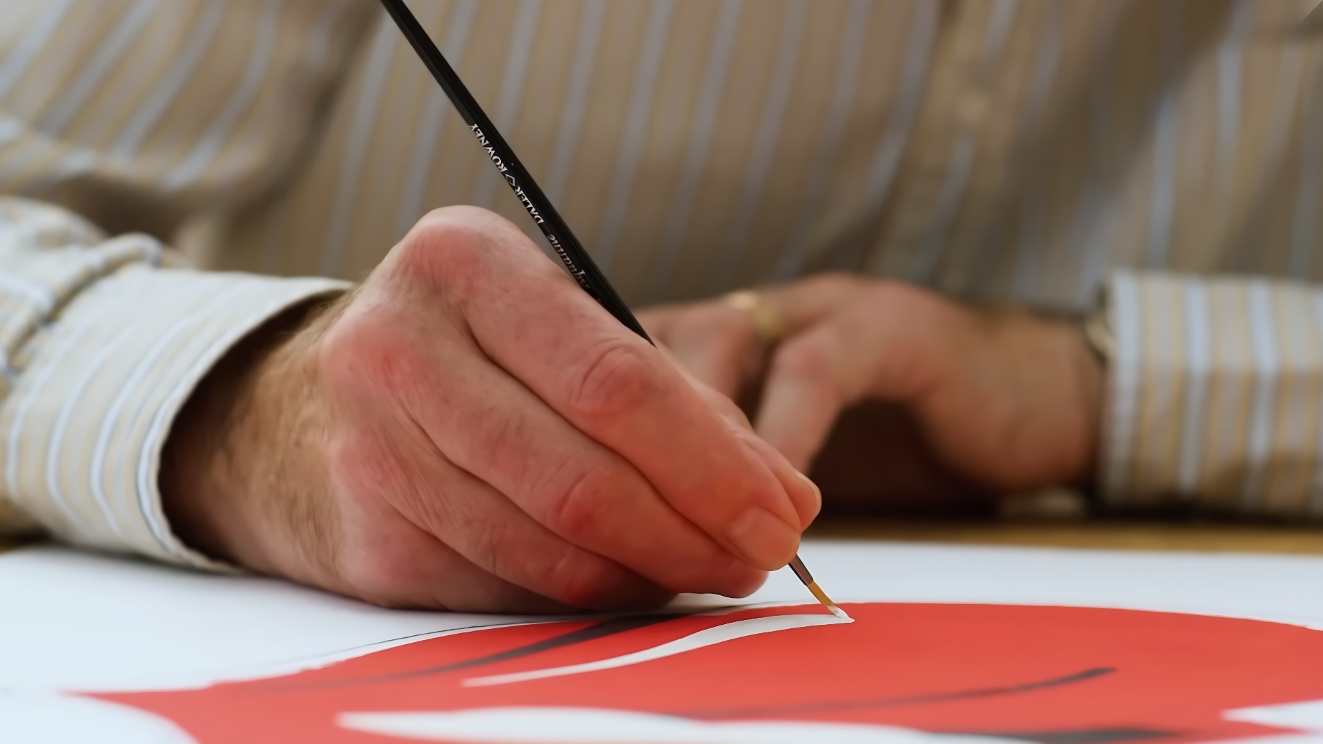
The first design wasn't the final answer. Trust had to be earned.
Pasche's initial work focused on tour-related artwork rather than a logo. Although it wasn't exactly what the band wanted, the collaboration continued and led to a much bigger opportunity.
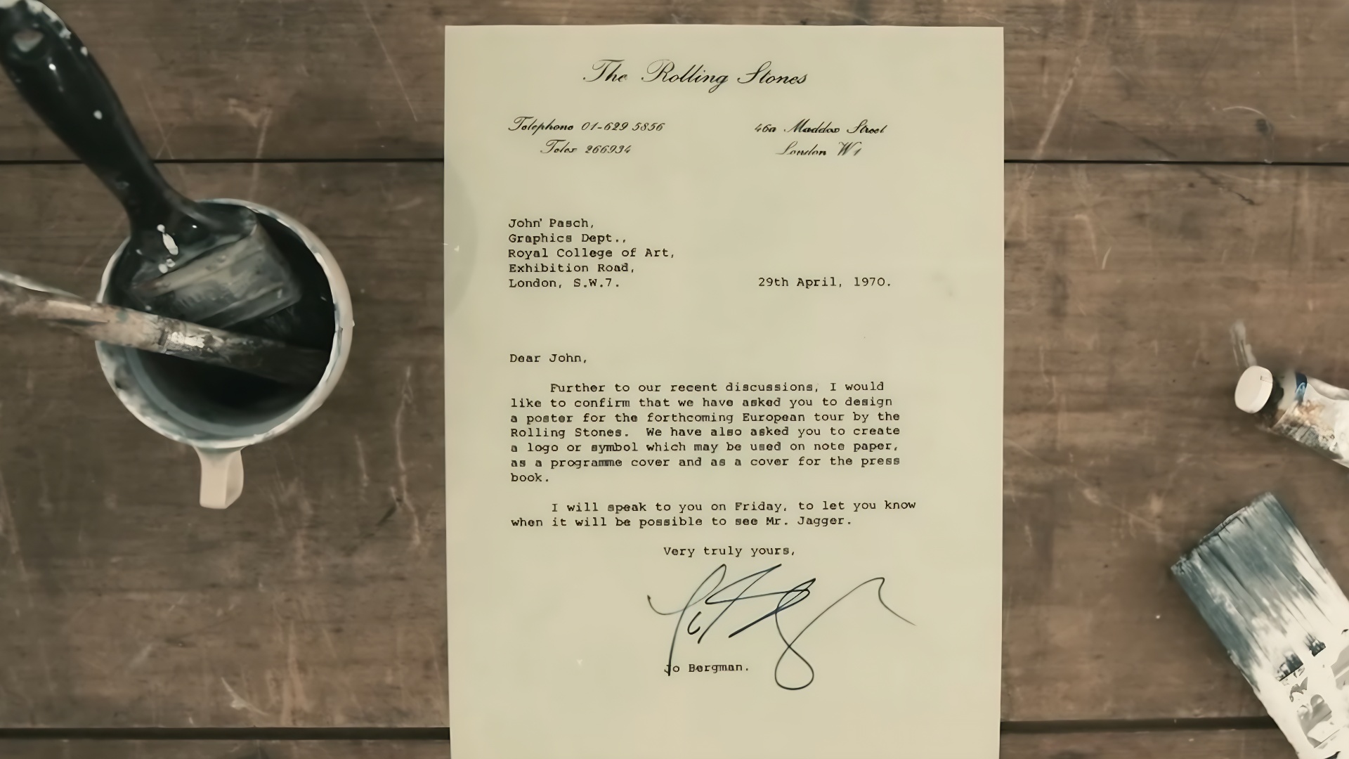
The band wanted a symbol that stood alone. Simplicity became the goal.
Mick Jagger asked for a bold logo that could instantly identify the band's new record label. The design needed to work independently, much like a recognizable corporate emblem.
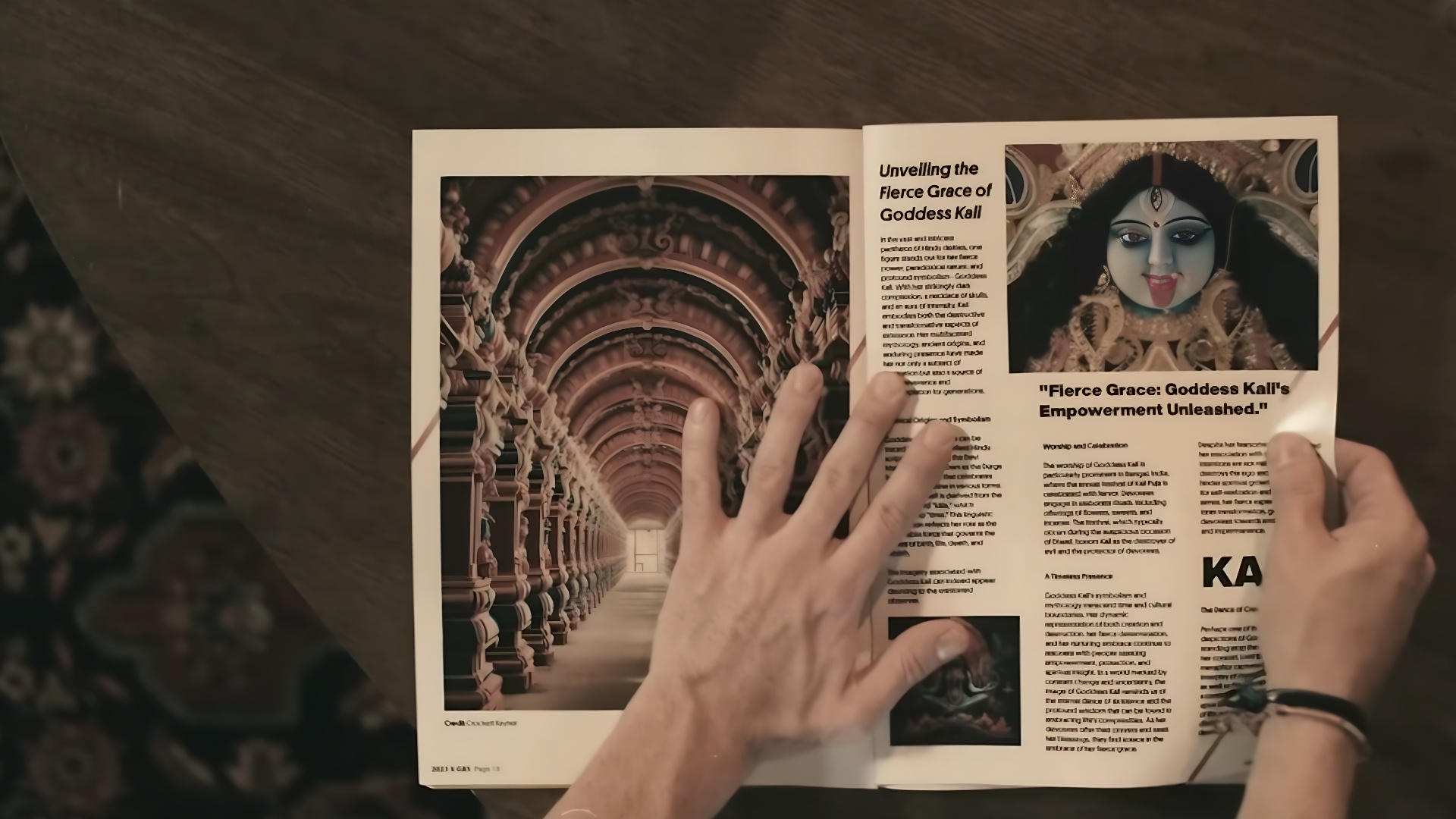
An ancient image inspired a modern design. A new idea took shape.
Jagger shared an image of the Hindu goddess Kali with her tongue extended. That visual reference became the starting point for a fresh and original concept rather than a direct copy.

Bold lines captured a rebellious spirit. The design reflected the band's identity.
Pasche created a simple graphic that conveyed confidence, defiance, and energy. Its clean, memorable form made it easy to reproduce across many different formats.
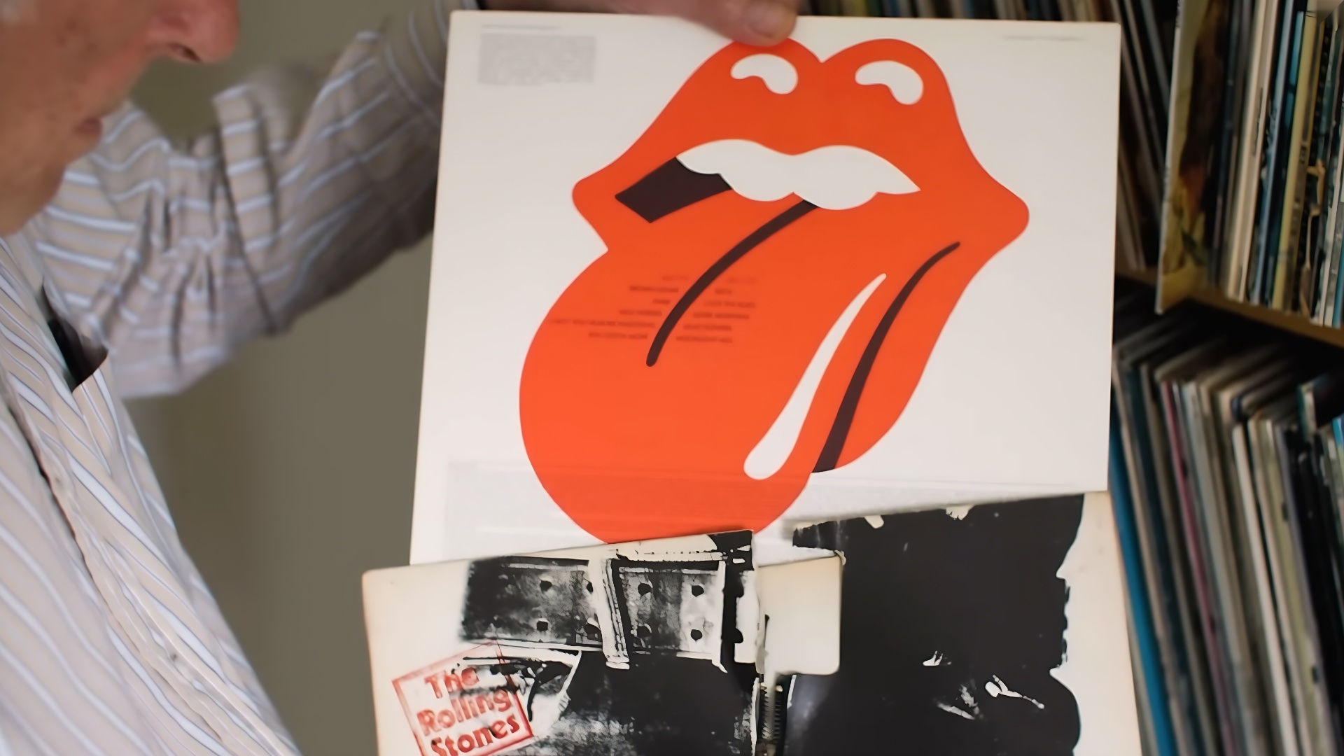
The logo wasn't based on Mick Jagger's lips. A common myth persisted.
Although many people associate the image with Jagger's distinctive mouth, Pasche explained that he envisioned it as a woman's lips. The bright red color helped the logo stand out.
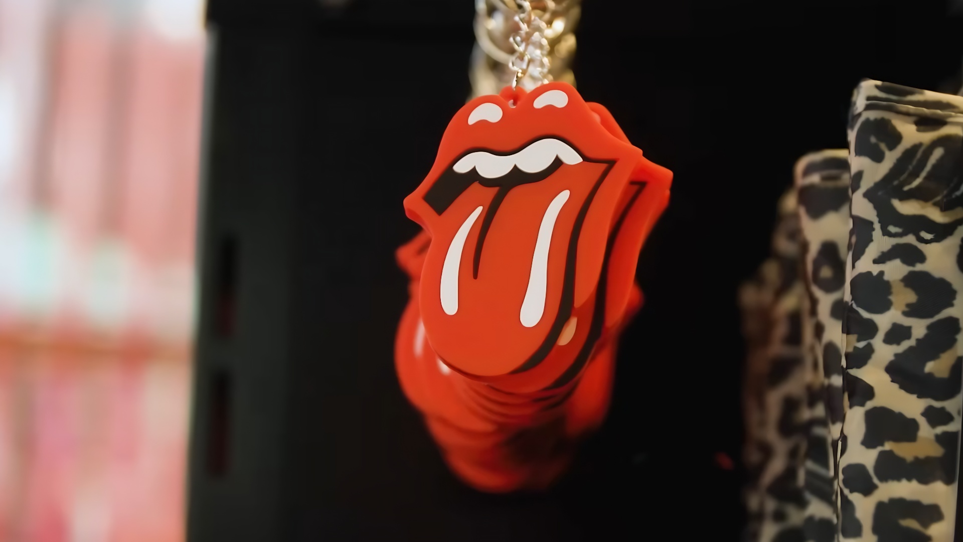
It debuted with ‘Sticky Fingers’. Its reach soon expanded worldwide.
The tongue logo first appeared on material connected to the 1971 ’Sticky Fingers’ album. It quickly spread to posters, records, clothing, and countless pieces of merchandise.
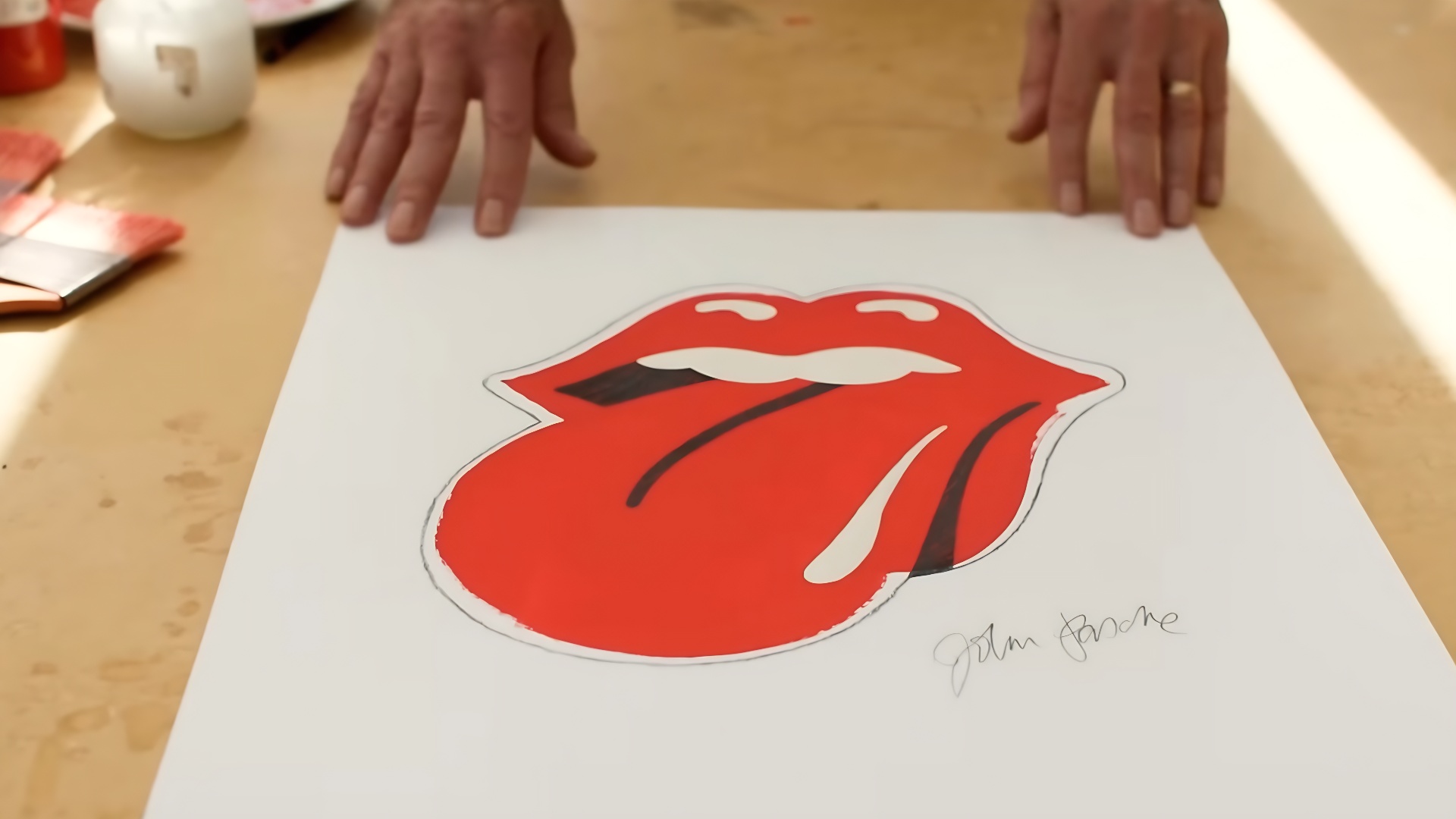
The symbol outgrew the band itself. It became part of popular culture.
Over the decades, the logo has remained one of the most recognizable images in music. It is instantly associated with rock culture and has been embraced by generations of fans.

A student created an enduring classic. Great design can define an era.
John Pasche's work demonstrates how a simple visual idea can become a lasting cultural symbol. More than five decades later, the Rolling Stones' tongue logo remains one of the world's most influential designs.